Tap#
Download this notebook from GitHub (right-click to download).
Title: HeatMap Tap stream example#
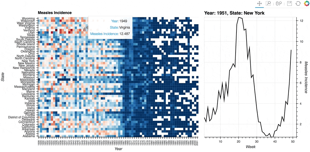
Description: A linked streams example demonstrating how use Tap stream on a HeatMap. The data contains the incidence of measles across US states by year and week (obtained from Project Tycho). The HeatMap represents the mean measles incidence per year. On tap the Histogram on the right will generate a Histogram of the incidences for each week in the selected year and state.
Dependencies: Bokeh
Backends: Bokeh
import numpy as np
import pandas as pd
import panel as pn

import holoviews as hv
from holoviews import opts

hv.extension('bokeh', width=90)


First, let’s look at an extremely simple example.
We will create an empty hv.Points element and set it as the source for the Tap stream.
# Create an empty Points element
points = hv.Points([])
# Create the Tap stream with the points element as the source
# We set the x and y here with starting values
stream = hv.streams.Tap(source=points, x=np.nan, y=np.nan)

# Create a callback for a dynamic map
def location(x, y):
    """Create an empty plot with a changing label"""
    return hv.Points([], label=f'x: {x:0.3f}, y: {y:0.3f}')


# Connect the Tap stream to the tap_histogram callback
tap_dmap = hv.DynamicMap(location, streams=[stream])

# Overlay the Points element (which is linked to the tap stream) with the location plot
points * tap_dmap
Now let’s see what it looks like if we used Panel to give us more control over layout and event triggering
# create an empty Points element
points = hv.Points([])
# Create the Tap stream with the points element as the source
# We set the x and y here with starting values
stream = hv.streams.Tap(source=points, x=np.nan, y=np.nan)

# make a function that displays the location when called.
def location(x, y):
    """Display pane showing the x and y values"""
    return pn.pane.Str(f'Click at {x:0.3f}, {y:0.3f}', width=200)

# Display the points and the function output, updated
# whenever the stream values change
layout = pn.Row(points, pn.bind(location, x=stream.param.x, y=stream.param.y))
# display the container
layout
Finally, we will now look at a more complex example.
# Declare dataset
df = pd.read_csv('https://assets.holoviews.org/data/diseases.csv.gz', compression='gzip')
dataset = hv.Dataset(df, vdims=('measles','Measles Incidence'))

# Declare HeatMap
heatmap = hv.HeatMap(dataset.aggregate(['Year', 'State'], np.mean),
                     label='Average Weekly Measles Incidence').select(Year=(1928, 2002))

# Declare Tap stream with heatmap as source and initial values
posxy = hv.streams.Tap(source=heatmap, x=1951, y='New York')

# Define function to compute histogram based on tap location
def tap_histogram(x, y):
    return hv.Curve(dataset.select(State=y, Year=int(x)), kdims='Week',
                   label=f'Year: {x}, State: {y}')

# Connect the Tap stream to the tap_histogram callback
tap_dmap = hv.DynamicMap(tap_histogram, streams=[posxy])

# Get the range of the aggregated data we're using for plotting
cmin, cmax = dataset.aggregate(['Year', 'State'], np.mean).range(dim='measles')
# Adjust the min value since log color mapper lower bound must be >0.0
cmin += 0.0000001

# Display the Heatmap and Curve side by side
(heatmap + tap_dmap).opts(
    opts.Curve(framewise=True, height=500, line_color='black', width=375, yaxis='right'),
    opts.HeatMap(clim=(cmin, cmax), cmap='RdBu_r',
                 fontsize={'xticks': '6pt'}, height=500, logz=True,
                 tools=['hover'], width=700, xrotation=90,
                 )
)
Download this notebook from GitHub (right-click to download).