Heatmap tap 
- Title
- HeatMap Tap stream example
- Description
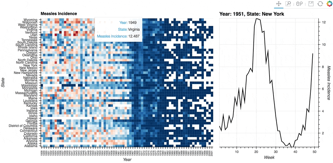
- A linked streams example demonstrating how use Tap stream on a HeatMap. The data contains the incidence of measles across US states by year and week (obtained from [Project Tycho](http://www.tycho.pitt.edu/)). The HeatMap represents the mean measles incidence per year. On tap the Histogram on the right will generate a Histogram of the incidences for each week in the selected year and state.
- Backends
- Bokeh
- Tags
- streams, tap, interactive
In [ ]:
import pandas as pd
import numpy as np
import holoviews as hv
from holoviews import streams
hv.extension('bokeh', width=90)
In [ ]:
%opts HeatMap [width=700 height=500 logz=True fontsize={'xticks': '6pt'}, tools=['hover'] xrotation=90] (cmap='RdBu_r')
%opts Curve [width=375 height=500 yaxis='right'] (line_color='black') {+framewise}

# Declare dataset
df = pd.read_csv('http://assets.holoviews.org/data/diseases.csv.gz', compression='gzip')
dataset = hv.Dataset(df, vdims=[('measles','Measles Incidence')])

# Declare HeatMap
heatmap = hv.HeatMap(dataset.aggregate(['Year', 'State'], np.mean),
                     label='Measles Incidence').select(Year=(1928, 2002))

# Declare Tap stream with heatmap as source and initial values
posxy = hv.streams.Tap(source=heatmap, x=1951, y='New York')

# Define function to compute histogram based on tap location
def tap_histogram(x, y):
    return hv.Curve(dataset.select(State=y, Year=int(x)), kdims=['Week'],
                   label='Year: %s, State: %s' % (x, y))

heatmap + hv.DynamicMap(tap_histogram, kdims=[], streams=[posxy])
Download this notebook from GitHub (right-click to download).